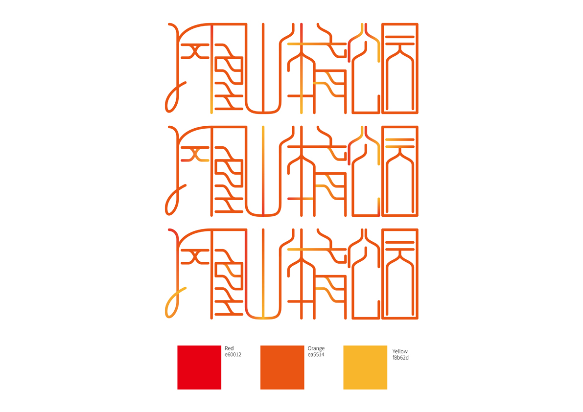
The pattern of this work is inspired by the design of the main stadium of Phoenix Hill Sports Park. Using the outline of this giant structure as the logo quickly reminds the audience of this new landmark building. Three "8"-shaped symbols of different sizes overlapped to form the pattern. Red, orange, and yellow are chosen because these three analogous colors show rhythmicity and highlight vigorous sportsmanship. The Chinese font part uses modular curves and straight lines. The coherent and beautiful continuous stroke design combines the essence of traditional Chinese calligraphy. The English font turns “O” into the "8" glyph in the logo, which echoes the pattern. In this way, English fonts can be applied to different media. It can also be used independently of Chinese characters and patterns. The san serif is in line with contemporary design aesthetics.
本作品圖案部分靈感來自鳳凰山體育公園的主場館設計,用這一巨型結構的輪廓作為logo能夠讓受眾快速地聯想到這個新的地標建築。三個大小不一的 “8”字形符號重疊在一起組成了該圖案,顏色上選用了紅,橙,黃三個鄰近暖色,讓整體logo有節奏和韻律美,又凸顯出朝氣蓬勃的體育精神。中文字體部分運用了特定弧度的曲線和若干直線,連貫優美的連筆設計結合了中國傳統行書的精髓,行雲流水,對字體的控制在動感和秩序之間游刃有餘 。英文字體部分將O化作了logo圖案裡的“8”字形符號,和圖案交相呼應。這樣可以讓英文字體適用於不同媒體,亦可脫離中文單獨與圖案使用。無飾線扁平化的字體設計符合當代的設計審美,不盲目追逐潮流,卻在新穎的同時耐看。